Tuesday, December 31, 2013

... is a many-splendored thing

My quilt is on turquoise silk dupioni given to me by my sister a long, long time ago. Enough said about my sister. I love her.  Very much.

I also love rummaging through my collections of "stuff" and finding things that I started to make (?) or was thinking "what if",  or wondered "what on earth will I do with that?". This piece is loaded with those things. Pearls. Beads. Paint. Tyvek. Lutradur. Angelina fibres. Mistyfuse. Melty areas. Alcohol paints - I love how they interact with each other. Pearl-Ex ... and on and on.

Several months ago, I hand-quilted some random circles on the silk and forgot about it until I was looking for background fabric for the Tyvek. About that same time, I made the rectangular piece out of other "what ifs" (Lutradur, heat gun, paint Mistyfuse, Angelina fibres) and I like the way it looks on the top, with pearls, sequins, crystals and beads. 

The upper right corner of the Tyvek has been left open to let more love in and out - and I have purposely left the edges raw and let the Angelina fibres spill off the edges.

Happy 2014, everyone!

Monday, December 30, 2013

First Snowfall

There is something magical about stepping out your back door and all you can hear is snow falling. One gorgeous evening here at home the sky was a deep blue black, no cars, no people, everything out in the garden was covered in a pristine blanket of snow. All our trees had a soft fluffy blanket around them.
 I have been wanting to do a piece based on this photograph for a while now and this challenge seemed to fit the bill.  Many of my friends will tell you I love trees. I have loads of pictures of trees, of bark, of moss ect.
I had to edit the piece down as we are working in a 12x12 format.


I played with adding some "snow" to the branches but didn't really like it so I took it off.
So I added some snow to the bottom of my tree, and liked that better.


Here is the finished piece. This was a very interesting challenge. (getting a good photo of the finished piece was also a challenge) I hope you all "Love" it!


Sunday, December 29, 2013

Love is at the Heart of all Things....

Write it on your heart 
that every day is the best day in the year.
~Ralph Waldo Emerson

Our quarterly challenge topic is LOVE!  When I think of love, I think of hearts, in this case LOTS of hearts (64 to be precise).  This piece definitely took much, much, much more time than anticipated. The first picture is of the entire piece and each subsequent one is a close-up of a portion of it.


Monday, December 16, 2013

Chocolate Fantasy!

Chocolate Fantasy?! you are thinking - I thought the theme was love! Well at first I found the topic to be quite challenging. I had some lovely ideas but as always the issue was how to execute the ideas. Maybe I was over thinking this. So I asked my husband what image came to mind when I said "Love" and he said "I love Chocolate Cake". Feeling very inspired I raided Glady's fabric stash for the perfect piece of velvet and proceeded to make cake. This piece came together pretty fast and I have to admit I had a lot of fun making it. The hardest part was getting a decent picture! You would never know it was a cloudy day when I took these.
This picture isn't too bad but still a touch shiny so I tried again.


I think you can see the detail better on this one. The ribbon is from our favorite place to buy cake that you can actually eat! Its from Cakebread bakery so decadent hubby and I share a slice.


 So you may be wondering about the "Chocolate Fantasy" well in my very active imagination the background is dark chocolate wallpaper, the velvet cake with satin icing and chocolate sprinkles speak for themselves (I hope) and the plate is chocolate too!!! I hope you "love" chocolate cake too!!

Wednesday, October 30, 2013

Kathy's Celestial

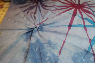
For my celestial piece, started with white fabric and dyed it a soft blue. I selected  four different colors of Jacquard Dye-Na-Flow for each color, I ironed creases into fabric to form a star-like impression.
I loaded up a paint brush with Dye-Na-Flow and lightly moved it along the top of the creases until the paint had been used. I repeated the process for each of the four stars.
After the dyeing process, I machine echoed stitched around the stars.
Lastly, I hand embroidered each of the stars with a contrasting colored embroidery thread.
Enjoy! Kathy

Monday, October 7, 2013

CELESTIAL EYED GOLDFISH by Gladys Love

When this theme was announced, I immediately thought of moons, stars, planets, the milky way, and other galaxies.  I also thought of two people I know with kind of "celestial" personalities....lovely, gentle, sort of ethereal persons who constantly amaze me with their ability to see life as magical. 
However, since I don't have that kind of personality.....I had to really think to come up with something that would fit this theme.  I googled images for "celestial" and got many many that would fit in with what I had been thinking.  And then one popped up that made me laugh and I thought it was perfect. It made me happy! It was a "Celestial Eyed Goldfish".  Here is the photo that I worked from. 

I have had the great pleasure of taking a class from Carol Shinn (http://www.carolshinn.com/) who is well known for her thread painted works of art.  I decided that would be the perfect way to present this little fish.  It was printed onto canvas with an ink jet printer, and away I went, stitching in all the colors and trying to duplicate his comical expression.
 
I wasn't happy with the way his tail was not visible so I took artist's license and drew it in.  Here it is partially done. 
 
I was quite happy with the way this looked and continued filling in the tail.  I had a little helpful input from my son, who raises koi, as to the colors in the "fantasy" tail.  I learned from another project that it was important to do the eyes first or they look terrible after all the other work is done and then your project is wasted.  So the order of work was the eyes, the body, the background and then the tail. 

I was quite pleased with how the canvas flattened out behind the fish as I progressed with the colors.  A learning experience as I made some of the stitches go different directions and I think this helped.  When all done, I cut him out of the canvas so he was a free form "patch" that I could apply to a 12 x 12 background. 


The background is a technique learned from my friend Joan, who did one of our challenges with strips of old silk.  We had split two skeins of these strips between us so I decided to use all my "watery" colors for the background.  Here is what it looked like as I played with the
background.  I was dissatisfied with the white edges showing.  I had carefully trimmed the canvas away and then pulled out the warp threads to give it the thready edge, but the canvas color made too much contrast with the background for my liking.

So out came the fabric pens and I colored the front and back of each section to match the thread beside it.  This was better.  I was quite happy with the look of the silk so did some free motion quilting to fasten it down, added some embellishments and here is my "Celestial Eyed Goldfish".


And here is a close up of the threadwork, and a photo taken of it flat to show the three dimensional effect in the eyes and tail. 


I think my beading is not random enough so I may be adding more to make it look more natural.  I'm told random beading is the most difficult!  Apparently that's true!   Now, on to LOVE! 

Tuesday, October 1, 2013

CELESTIAL by Margaret K.

margarets1ofakind@gmail.com

I had previously done two art pieces based on "celestial" so it was a challenge to come up with a third.  This first photo is of a "full moon rising, Haida Gwaii" from when we were camping there in 1990, the year of a super moon.  The background navy was from old satin curtains.  The full moon was of white satin with Angelina and tulle stitched on top.  It was a perfectly clear night, but I decided to add the cheese cloth for dramatic effect!  A few Swarovski crystal stars and some eyelash wool wrapped around pipe cleaners for trees and depth.


My second "celestial" project was "Cosmic Ring".  I had just started dyeing fabric and had a pretty little piece ice dyed with a "nice" circular pattern.  I was thinking of fossilized ammonites.  We were cruising the Panama Canal and I wanted a hand project, so off to the bead store.  Lo and behold, more Swarovski crystals and one in particular called a "cosmic ring".  Title and theme established.  Finished on the Lido Deck!!


So this is my third celestial piece!  Again, I was not only hand dyeing fabric, but also playing with various tools and soy wax.  What fun!  I liked the dark multi coloured northern lights kind of effect of the dyes, and I really like what my  potato masher produced.  So,  drum roll, presenting  for your enjoyment, "Spudnik"!


More Swarovski crystals and a touch of Angelina to get a focal point.  Hologram thread over supporting spudniks as they return to their home base.  What more can I say.....  


Sunday, September 29, 2013

Surface

I had a lot of ideas when I chose "Celestial" as a theme for this latest challenge but executing the ideas was a little harder than I planned! Only one piece got thrown out. Several ideas ran into some pretty big hurdles and where abandoned before they truly got started.
So I finally grabbed some crazy supplies and threw caution to the wind and just went where the piece took me without much planning or forethought at all.
I decided rather than make a planet, strange new galaxy I decided just to go for a surface. So this is my interpretation of  what the surface of far away planet would look like - say maybe Jupiter??
For this piece I used puff paint, Setacolor! shaved aluminum from my hubby's machine shop, beads and eyelash yarn.
It was quite a journey making this piece, not quite a trip to space but briefly I felt I had reached the stars:-)

Here is just after I painted the puffpaint.


Here is the finished piece:

 Here is a detail shot of the aluminum.

Wednesday, September 18, 2013

CELESTIAL - SOPHIAS' BLUE MOON

Hi, 12 x 12'ers! I finally managed to complete a challenge - and it's early! (Okay ... so I cheated a little. I started this piece for another exchange, but made a mis-cut.)

I have named my quilt "Sophias' Blue Moon" in honour of the birth of my great(est) niece, Sophia Marie, who was born in Virginia, USA, during the blue moon on August 20. My inspiration came from a photo I took that night. I cannot wait to meet her when she, her mom and dad, come to Vancouver Island for Christmas!

The quilt is also to honour my dear friend, Sophia (Sophie), who is rapidly losing her battle against a rare, aggressive form of ovarian cancer.  I met Sophie (our future bridesmaid), her future husband (our future best man), and my future husband at a Lighthouse concert at UVIC nearly 45 years ago. Sophie's husband and my husband have known each other for well over 50 years.

This summer has been filled with a lot of emotional upheaval for us. Some bad, with a good outcome and some bad, with a bad outcome. One of the bad/good was the adoption of two one-year-old Golden Retrievers, who have done their best to keep us entertained and on our toes. I know you are just waiting to see them, so here they are:  from left to right - Jake and Molly!


Sophias' Blue Moon is black cotton on Timtex, lots of MistyFused Angelina fibres, Textiva MistyFused to gold lame over gold mesh, free-motion machine stitching, french knots and machine-stitched cord around the edge.  Angelina fibres don't like being photographed!


Deep peace of the shining stars to you, Sophias. 
I love you both.

Sunday, July 7, 2013

MAGNIFICATION by Gladys Love

I started out the same way as everyone else on this one.....out with my camera and snapping shots of leaves, seed pods and flowers.  The photos were lovely and some unique, but not inspiring.  Then I decided to go through my library of photographs and see if anything I already had inspired me.  I found this one.  It was taken in Monterey, CA.  I loved this sea lion and his obvious lack of care for what is going on around him.  

I

Isn't he hilarious???  However, since the theme was magnification, and I was fascinated by the way the photo captured the water, I clipped a section out of the photo to work with. It is taken from the right hand side, just above the railing.  Here it is.  


This clip has not been enhanced or "photo shopped" in any way.  The colors and reflections are exactly as they are in a tiny little section of the photograph.  I loved it instantly and decided this would be my 12 x 12.  Magnified water.  Fabulous idea! To top it off, it would make it harder for everyone to guess what it is because I think it really looks a bit like First Nations art.  Do you agree?  

So, how to execute my fabulous idea.....After much thought I decided that I would trace the light blue water lines onto freezer paper, iron it onto a piece of light blue fabric that I had applied Misty Fuse to the back of,  and then cut it all out and lay it out on a dark blue hand dye fabric.  This worked nicely.  Then I cut some darker blue, some dark rose and some gold & brown and fiddled it in under the light blue so that it duplicated the photo above.  Here is the photo of my project as I approached it for stitching.  


But, in truth, it was a little horrifying when I pressed everything together and then removed the freezer paper. The polyester satin that I chose for this project did not react well.  When the paper was pulled off, and I was very gentle, all the edges frayed a little bit, losing the crisp look I wanted.  I had planned to stitch along all the edges of the light blue, but after it frayed with the removal of paper, I was a little nervous that it would fray further, so I decided to try stitching inside the light areas.  You can see that in the darkest pink pieces.  

But I didn't like that.  It wasn't the look I was going for.  I left it for a week or so while I pondered how to handle this dilemma.  When I went back to it, I tried applying Fray Check to the edges with a toothpick.  Not satisfactory.  Then I thought perhaps if I painted the surface it would stabilize it more.  Here is what that looked like.  I am still not happy. 


So, since the piece was bigger than 12 x 12 and I am experimenting on the edges, I thought I'd try something else.  The next solution was to couch some beautiful pale blue sparkly ribbon along the edge of the light blue, hopefully adding to the watery look and covering the frayed bits.  I tried doing it with a couching foot.  That proved too difficult to see where I was going on all the tight corners.  But I liked the look of it. 


That is, until I took it out of the machine and looked at it.  No matter what I set the stitch as, the ribbon puckered and looked dimpled or gathered and I felt it took away from the slick look I wanted for the water.  Here's a close up of the stitching and you can see a tail of the ribbon hanging off where I started. 


I didn't like it one little bit.  And now, because I've handled it so much, it is fraying more.  So...here is the finished project.  


MAGNIFICATION by Diane Boyko


I found this challenge to be interesting and thought provoking.   In my garden in April the ferns were unfurling.  They appealed to me.   Further along seashells were on the rocks.   The circular markings on the shell looked like a great shape to work with.


 The design is made of silk fusion over a cotton fabric.   The feathers are stitched with a rayon thread over a spiral guideline.  Shading was added later.   A fun project.

MAGNIFICATION by Margaret Kelly


There was a comment that we should guess what the subject is, so no further comment from me!